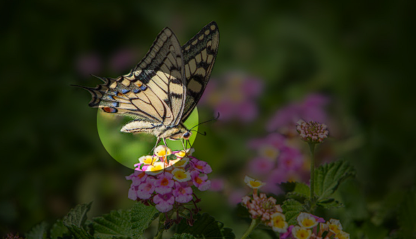
Here's how to create a circular spotlight effect where part of your image stays in color while the rest becomes like grayscale using Tailwind CSS:
<div class="relative w-96 overflow-hidden">

  <div class="absolute bottom-16 left-16 aspect-square w-36 rounded-full shadow-[0px_0px_0px_10000px] shadow-black/60"></div>

  <img class="object-cover" src="your-image.jpg" alt="grayscale-img" />

</div>
How It Works
1. The outer div creates a container with:
- relative: Allows absolute positioning of the spotlight inside
- w-96: Sets width to 384px
- overflow-hidden: Keeps the shadow effect contained
2. The spotlight div uses:
- absolute bottom-16 left-16: Positions the spotlight 64px from bottom and left
- aspect-square w-36: Creates a 144px × 144px circle
- rounded-full: Makes it circular
- shadow-[0px_0px_0px_10000px] shadow-black/60: Creates a large shadow overlay with 60% opacity
Try it yourself: [Tailwind Playground](https://play.tailwindcss.com/Ox04sWZ7RR)